
Helping an AI tutoring initiative tell its story at scale.
Product Design
UI/UX
Brand Identity
Developed visual assets and built reusable social media templates using Figma Buzz for PLUS, a CMU and Stanford led AI tutoring initiative, helping establish a scalable and consistent design system to communicate its mission to schools, researchers, and funders.

CONTEXT
A strong mission without a consistent way to communicate it.
PLUS needed a more clear and scalable visual identity system that could clearly communicate its AI powered tutoring mission across multiple stakeholders. I was given the task to create a clear message for multiple audiences: schools, researchers, potential funders.
Before joining PLUS, there was no systemized or scalable content creation guide and the brand consistency needed to be strengthened.
SCALABLE
SYSTEM
Create reusable branded assets & social media templates to reduce repetitive design work.
VISUAL UNITY
Establish a cohesive visual identity system across social, presentations, and marketing materials.
DIVERSE
AUDIENCE
Tailor messaging and visual hierarchy for schools, researchers, and funders.
APPROACH
Testing Figma Buzz
One of my goals for this project was to expand the range of tools I could confidently use in a workflow. Around this time, Figma introduced Figma Buzz, a feature designed to help teams scale branded content by enabling "non designers" to easily create assets using ready made templates and locked brand components.
Recognizing its potential, I translated PLUS’s existing social media designs into structured, reusable templates within Figma Buzz. Rather than simply duplicating past layouts, I rebuilt them as modular systems by defining consistent typography styles, spacing rules, color usage, and content blocks that could be easily edited without compromising the original designs.
increase efficiency by reducing repetitive design work
give all team members agency with minimal instructions to generate on-brand Instagram and LinkedIn posts
increase efficiency by reducing repetitive design work
give all team members agency with minimal instructions to generate on-brand Instagram and LinkedIn posts
Communicating a Message with Ease
Another thing I had to keep in mind was to create new designs from existing components that would better communicate PLUS's initiatives to varying stakeholders with different goals in mind. Furthermore, I had to make sure that these posts could be designed to be easy to use within teams that have little to no experience in design softwares such as Figma.

Brand System Guideline
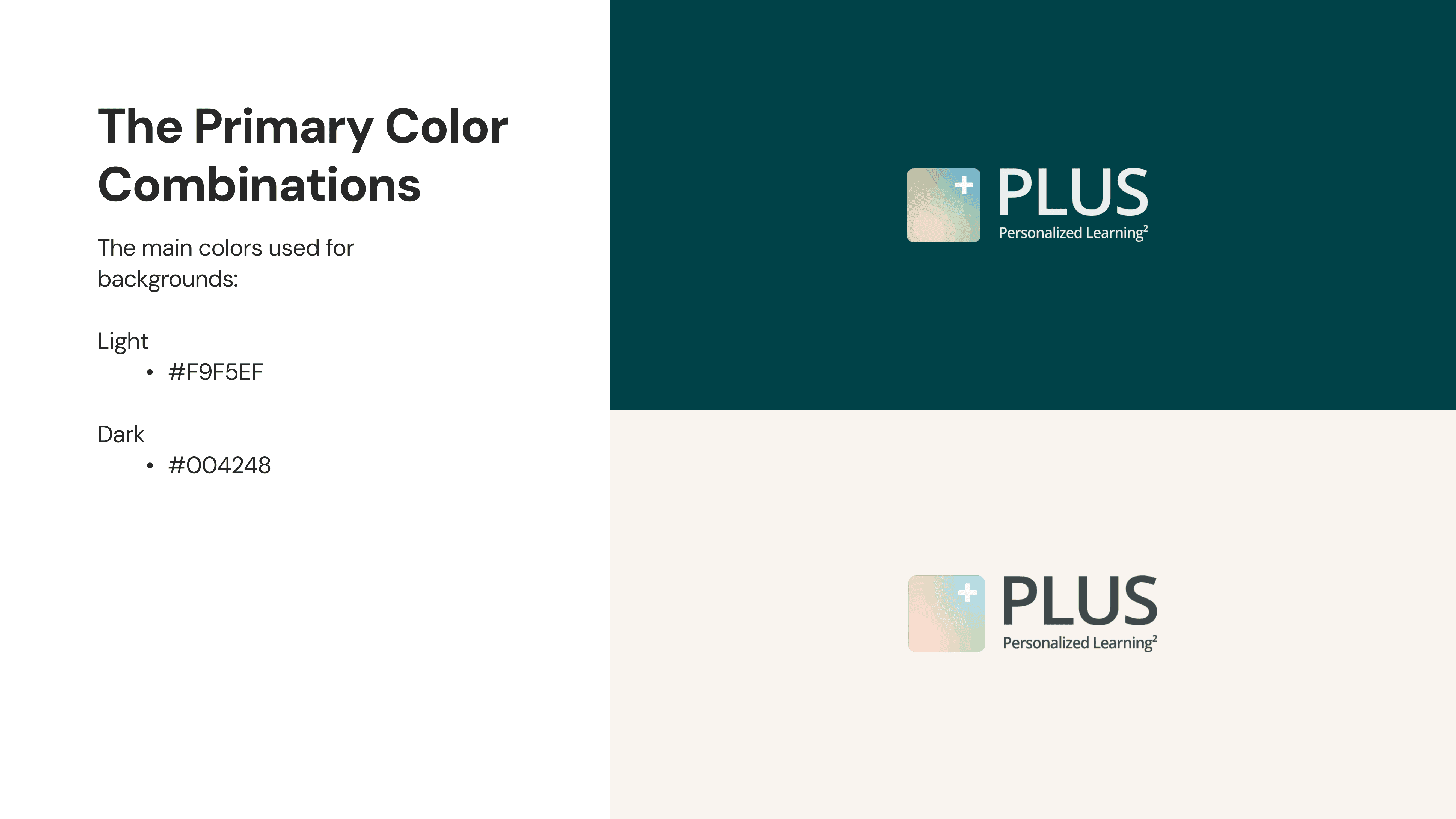
To ensure long-term consistency across PLUS’s growing set of materials, I developed a centralized Brand Asset Guide in Figma.
Prior to this, there was no formal documentation outlining typography, color usage, or visual principles, which increased the risk of inconsistent fonts, color schemes, and messaging across platforms.
As this was my first time creating a brand system, I researched other brands and the brand guidelines they have readily posted to ensure PLUS's documentation would be usable long-term.
I began by digging through existing designs and identifying recurring patterns in typography, color, layout, and visual tone. From this analysis, I created a cohesive brand system that formalized these elements into clear, accessible guidelines.
Most importantly, the guide was built to be usable by both designers and non-designers. By presenting the system in a clean, digestible format, I ensured that team members could confidently create materials that aligned with PLUS’s identity without needing advanced design knowledge.
SOLUTION
Final Deliverables
By the end of the semester, I delivered a finalized Brand Asset Guide, reusable Figma Buzz social templates, and a Google Slides system accessible to the entire team.




Figma Buzz Templates
Brand Asset Guideline



TAKEAWAYS
BEST VIEWED ON COMPUTER
What I learned
This project shifted my understanding of design from creating visually appealing assets to being able to build systems that have goals of clarity and importantly scale. Rather than focusing on individual graphics, I had to think about how visual decisions would function across diverse platforms and collaborators over time.
Translating the entire system into Google Slides also forced me to consider varying levels of design literacy and tool familiarity. I was reinforced with the idea that successful systems must meet users where they are instead of where designers expect them to be.
Working on a Team
Prior to this experience, much of my collaboration had been in short term hackathon settings. This project introduced me to a longer feedback cycle.
A long term project helped me learn how to stay aligned while teammates were working on similar initiatives. I was able to collaborate with others who were also still learning and experimenting. I learned how important it is to check in regularly to make sure that my progress aligned with the team's goals and adjust direction early so time and effort wouldn't be spent on the wrong priorities.